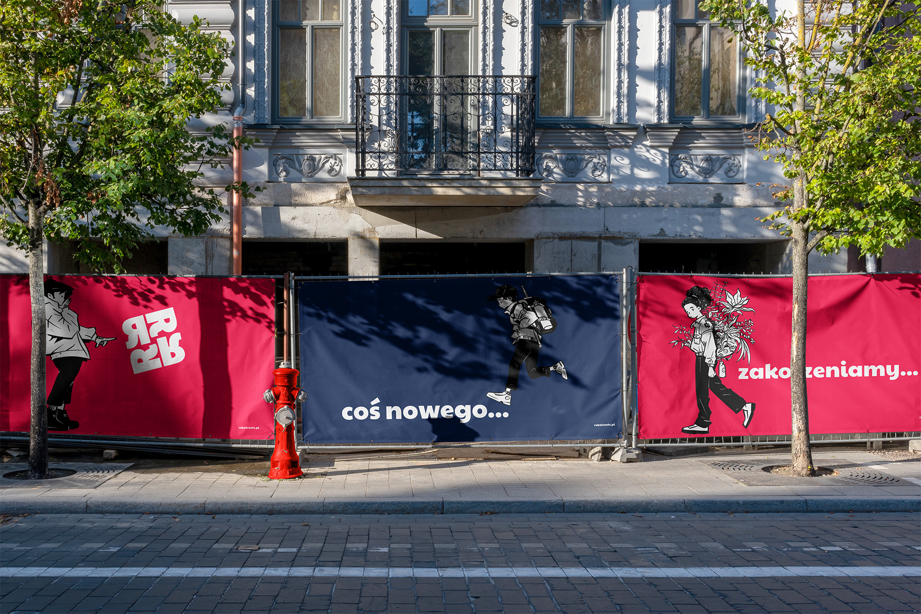
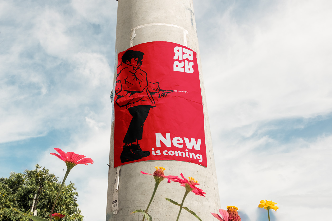
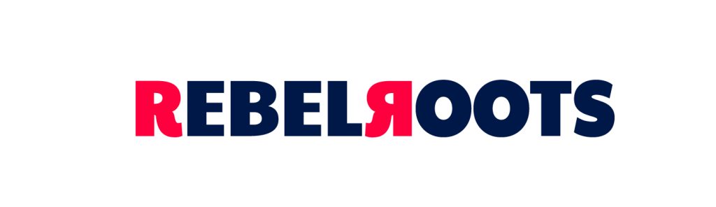
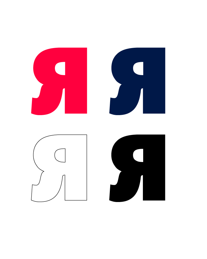
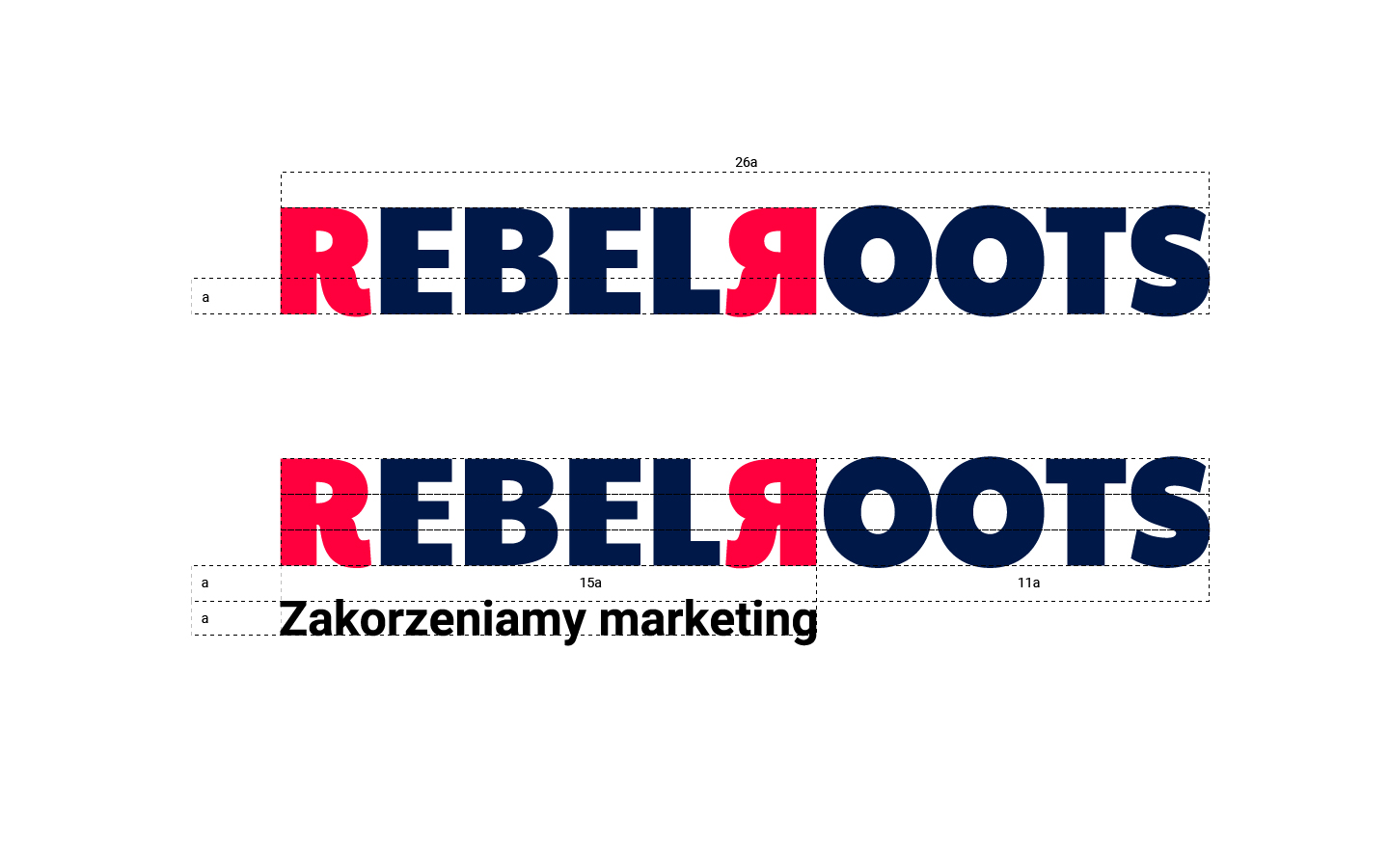
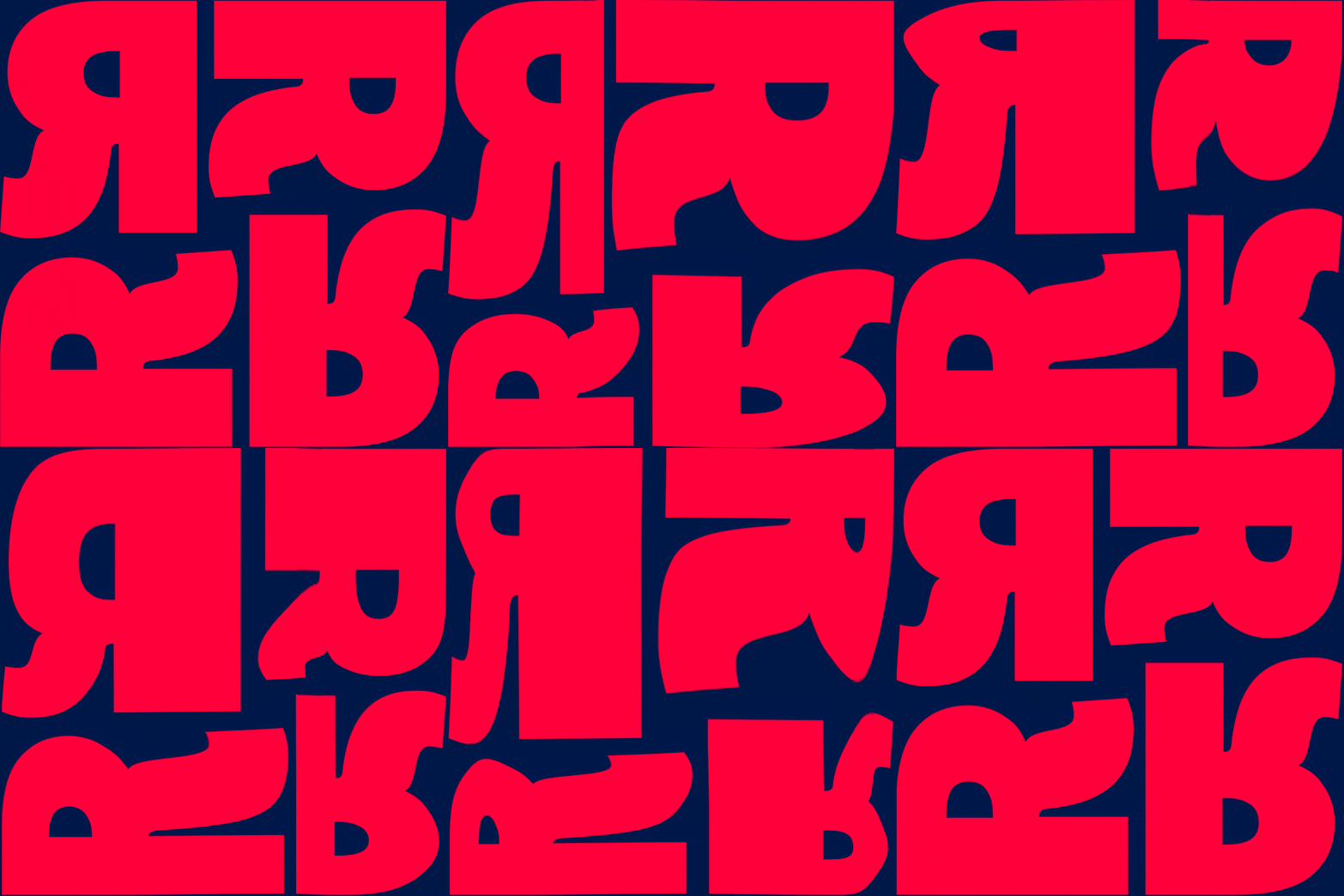
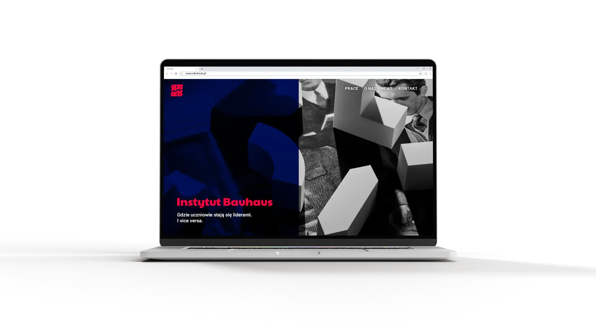
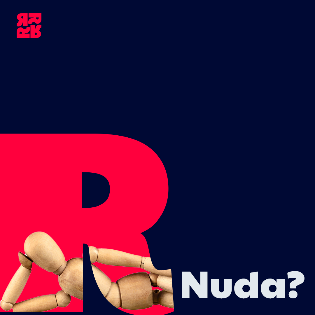
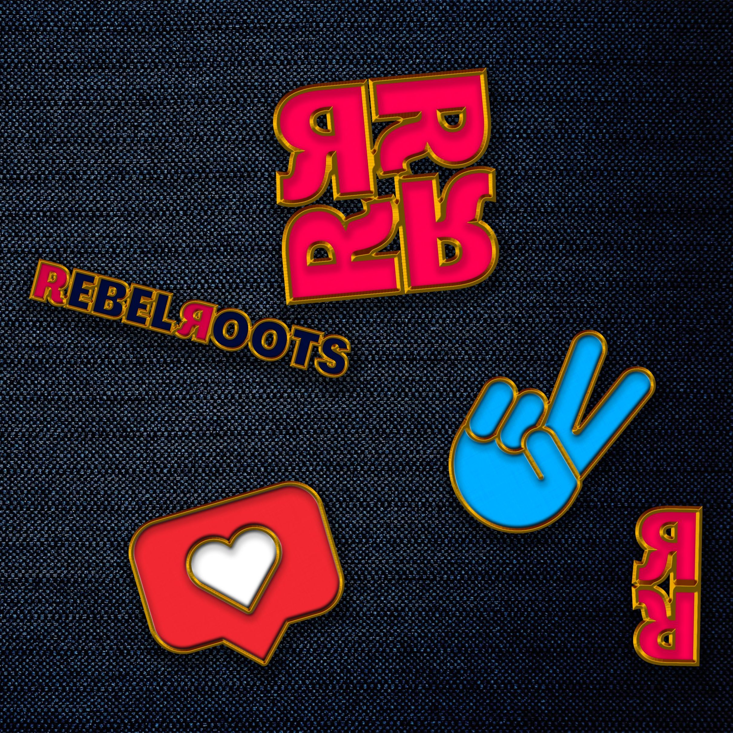
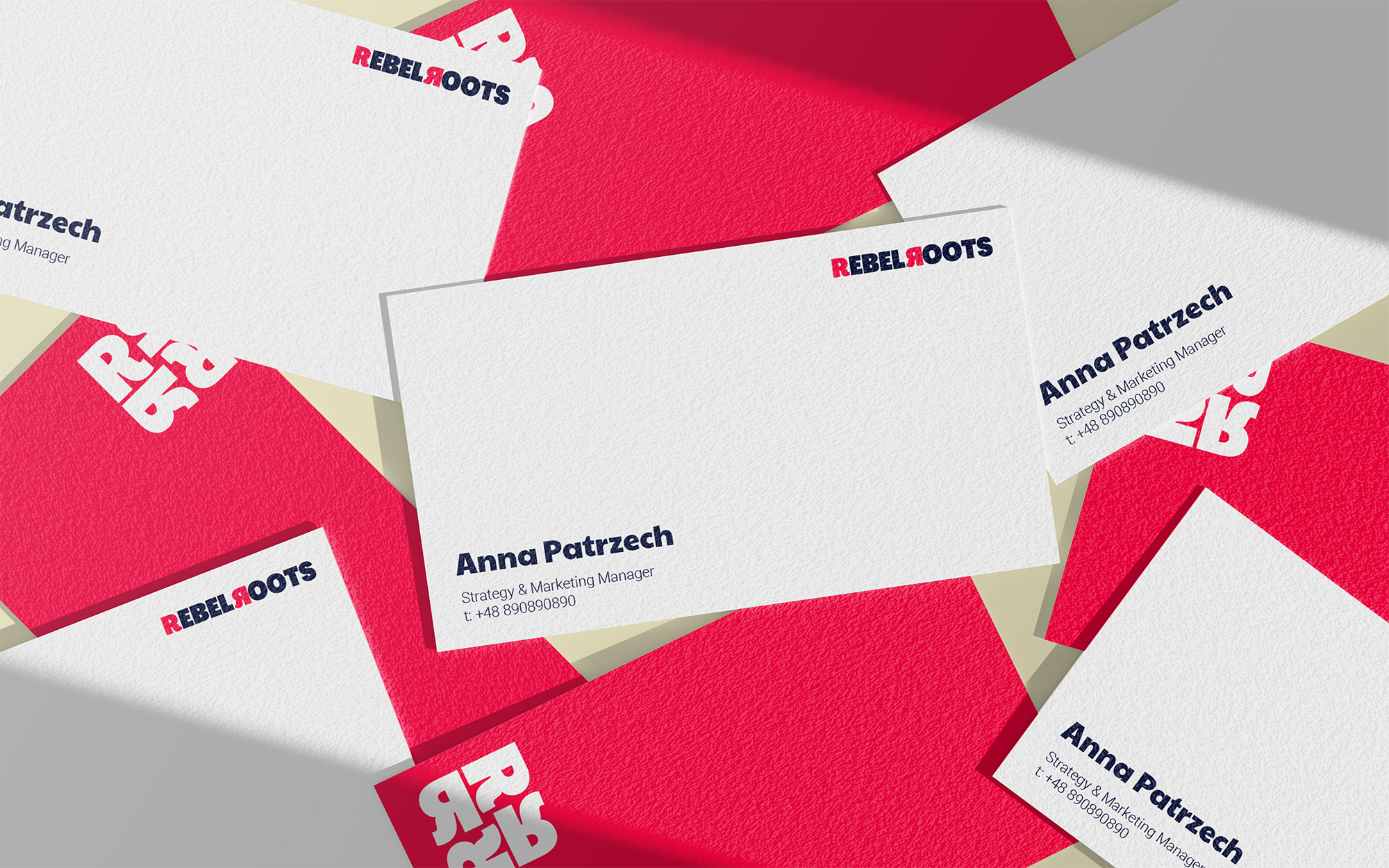
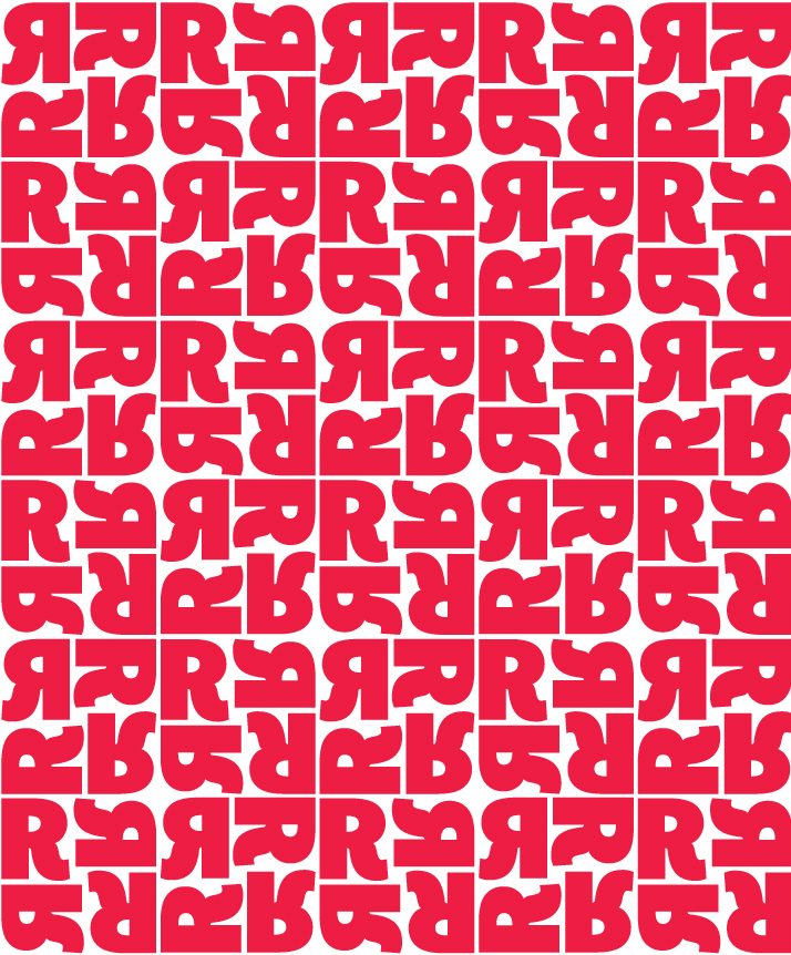
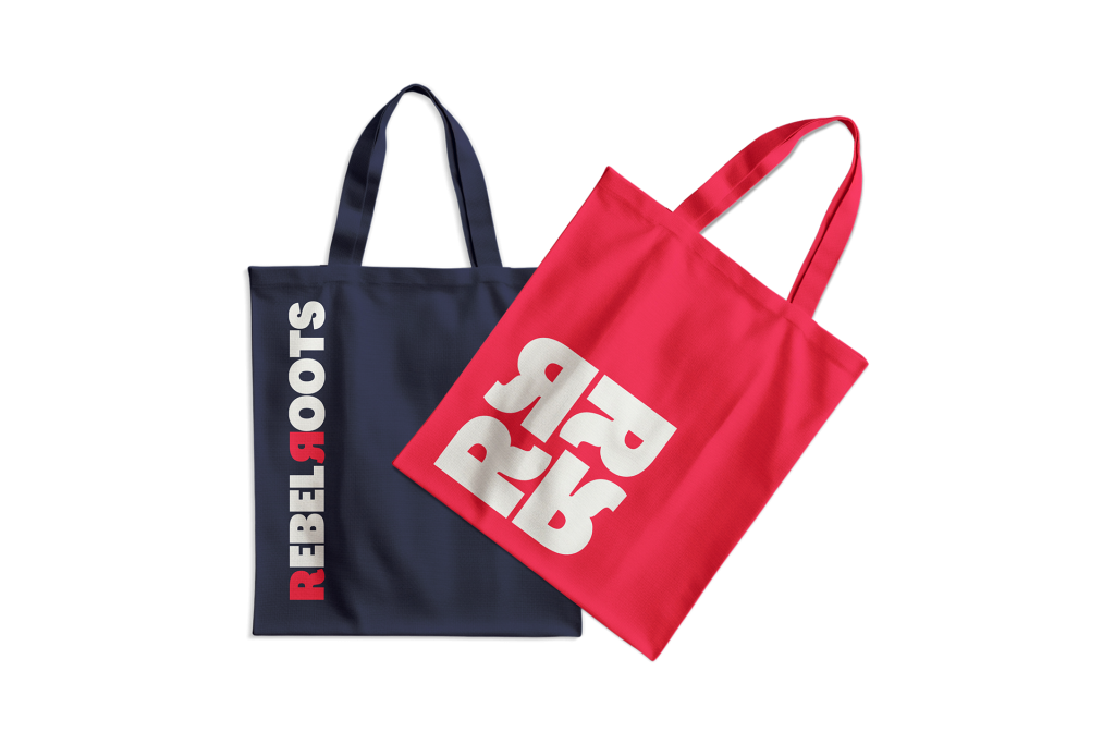
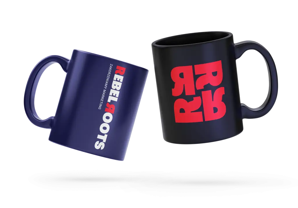
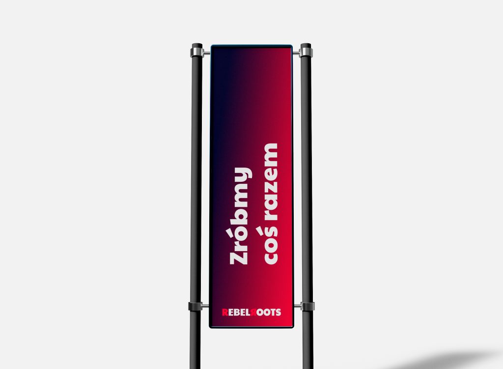
Rebel Roots is a 365 agency that is just entering the market. Rebel because the agency focuses on quality and revolutionary ideas, and Roots because the agency has solid roots in the form of other brands. We wanted the brand to stand out and be appealing at the same time. That is why we decided to use the brutalist shape of the letter R and contrasting colors. The idea of the logotype is an inverted letter R, which should be flexible and adaptable. The logotype is based on “dynamic branding”. We didn’t want it to be just a badge, but something that could be shown in different ways, showing the team’s great creativity and dynamically changing solutions for clients. The strong contrasting colors represent the struggle between revolution and constancy, or the harmony between these themes as they work together despite the contrast. In addition, the contrasts used also take into account freshness, youth and stability, experience and professionalism.
I designed the entire visual identity for the brand, along with concepts for the initial perception of the brand, as well as multimedia and promotional materials.
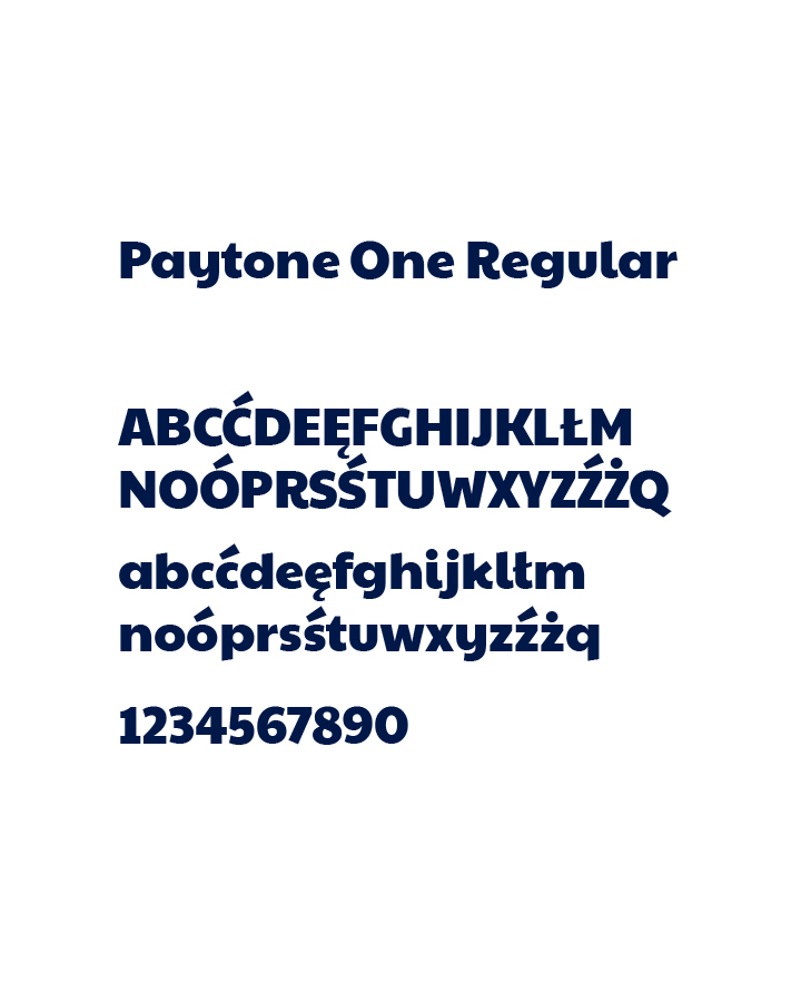
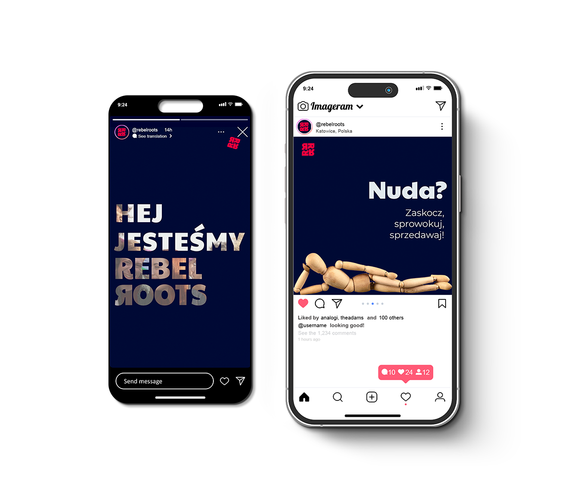
The need to show something new in a market that is already quite exhausted led us to use animation or strong short messages. Nowadays, when the attention is drawn in 2-3 seconds between swiping messages on the screen, it is necessary to show something more than a picture with text. For this purpose, we used animation and a rather distinctive Paytone One font. The complementary font is ROBOTO.
Do you like my works? Contact me and maybe we will do something cool together.